


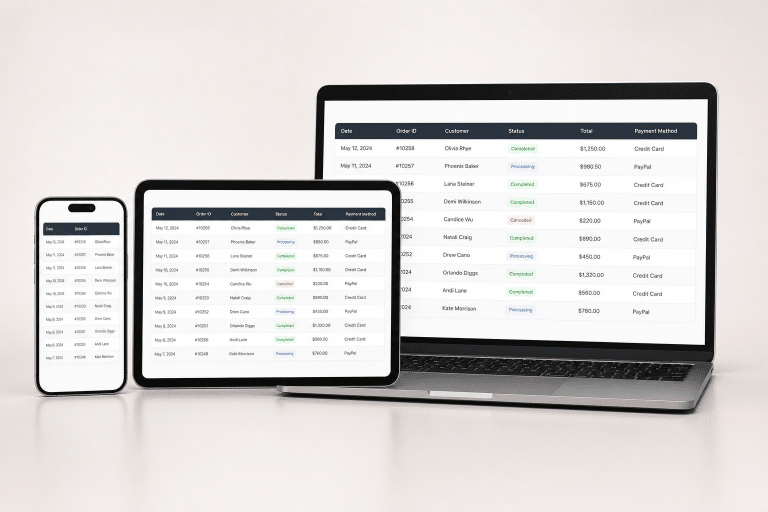
Data tables are still one of the fastest ways to compare related information, but they can become difficult to read when a desktop layout is squeezed onto a phone. Reviewing practical table ui examples can help teams see how hierarchy, spacing, and controls change across screen sizes without losing the user’s place.
The goal is not to fit every available field into the smallest viewport. A useful table helps people answer a specific question, such as which invoice is overdue, which task needs attention, or which option costs less. When the data is structured around that task, the result is clearer on phones, tablets, and desktops alike.
Why Tables Still Matter
Tables work best when people must compare values across several items. Pricing plans, order histories, schedules, financial reports, account records, and inventory lists are common examples. A chart may reveal a trend, while a card layout may suit browsing, but a table is usually better when exact values and side-by-side comparison matter.
That does not mean every dataset deserves a table. If users only need a summary or a single action per item, a list or a set of cards may be easier. Start with the job to be done, then choose the format that makes the relationship between values obvious.
Start With the User’s Main Task
Before designing columns, define the decision the interface should support. A project manager reviewing work may need the task name, owner, status, and due date immediately. Notes, labels, activity history, and attachments can remain available in a detail view instead of competing for attention in every row.
Questions to Ask Before Designing
- What decision should this information help a person make?
- Which values need direct comparison in the same view?
- Which columns can be hidden, moved, or revealed only when needed?
- Will people read, edit, export, filter, or take actions on several records?
- What will happen when content is missing, delayed, translated, or unusually long?
Identify the primary column early, because it gives each row an anchor. Group-related information near it, such as status and deadline, beside a task name. This reduces eye movement and makes a dense interface easier to scan.
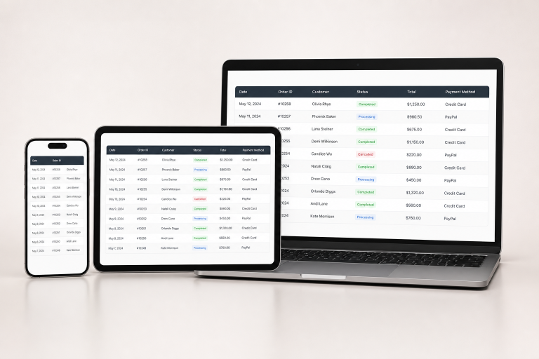
Choose the Right Layout for Each Screen
Responsive tables usually need one of three patterns. Wide datasets can use horizontal scrolling, provided the first identifier remains visible, and the interface clearly signals that more columns exist. Tables with a few essential fields can retain priority columns and place secondary details behind an expandable control. For records that do not require fast side-by-side comparison, stacked rows can show a label above each value.
Avoid shrinking every column until text becomes tiny or wraps into an unreadable block. Consistent behavior is more valuable than a dramatic layout change at each breakpoint. When a record contains many fields, a focused detail page or panel is often better than forcing all values onto a single mobile screen.
Make Tables Accessible From the Start
Use genuine data-table markup rather than images or decorative grid layouts. Each table needs a clear caption or nearby description, correctly identified column and row headers, and a logical reading order. Practical, accessible table guidance also reinforces the value of simple structures over nested or irregular layouts.
Keep keyboard focus visible on sortable headers, filters, links, checkboxes, and buttons. Do not rely on color alone to communicate a status such as paid, delayed, or failed. Pair colors with words, icons, or patterns, and ensure touch targets are large enough for one-handed use. Contrast must remain sufficient in default, hover, selected, disabled, and error states.
Improve Scanning and Comparison
Use short, familiar column labels and predictable formats. Text-heavy fields generally scan best when left-aligned, while numbers are easier to compare when right-aligned. Keep dates, currencies, percentages, and statuses consistent across every row. A value such as “Aug. 5” should not appear beside “2026-08-05” unless the difference is meaningful.
Spacing, light row dividers, and restrained alternating shading can establish structure without visual noise. Use badges only when they communicate a distinct state, not as decoration. Keep row heights reasonably steady, but allow important names or descriptions to wrap rather than hiding critical information behind an unexplained ellipsis.
Add Useful Controls Without Clutter
Search, sorting, filtering, pagination, and column selection are valuable when they solve a real problem. Place them close to the data they affect, make the current sort order visible, and show active filters in plain language with a simple reset option. Keep bulk actions separate from row-level actions so people do not accidentally affect multiple records.
Use progressive disclosure for secondary actions, especially on narrow screens. Infinite scrolling can feel convenient, but it is often a poor fit when users must compare records, return to a known row, or understand how many results remain. Pagination or a clear “load more” control can provide stronger orientation.
Test Tables in Real Conditions
Test beyond the polished design canvas. Try narrow and wide screens, 200 percent zoom, keyboard-only navigation, and at least one screen reader. Populate rows with long names, large values, blank fields, special characters, and translated text. Also test loading, empty, error, and partial-result states, because these conditions expose weaknesses that ideal sample data hides.
Use one hand to operate a phone to reach hard-to-reach controls and cramped targets. A tool with data table testing features can help review header associations, focusable elements, structure, and contrast, but it should support rather than replace hands-on testing.
Avoid Common Table Design Mistakes
- Forcing too many columns into a narrow viewport.
- Hiding important content without indicating that more information exists.
- Removing headers when rearranging rows for mobile screens.
- Using unlabeled icons or controls that resemble ordinary text.
- Making an entire row clickable when it contains multiple separate actions.
- Using color as the only sign of success, risk, or failure.
- Ignoring loading, empty, and error states.
A Simple Pre-Launch Checklist
- Confirm that the table supports a specific user task.
- Remove fields that do not help users decide or act.
- Select a responsive pattern that matches the dataset and device.
- Check captions, headers, labels, focus states, and contrast.
- Test sorting, filtering, pagination, editing, and bulk actions.
- Review realistic content on a phone, tablet, desktop, keyboard, and screen reader.
Clear tables come from selecting the right information, giving it a meaningful structure, and testing how real people use it. A well-designed table does not merely survive on a small screen. It remains readable, accessible, and dependable when users need to make a decision quickly.
